
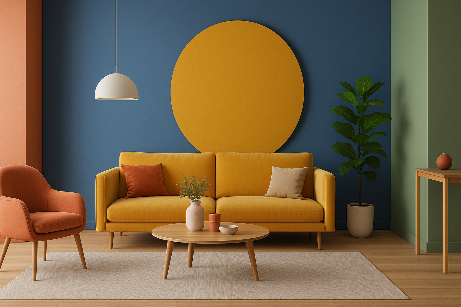
When we enter a space, we hardly take time to think about how the colours in our environment affect us. Yet, colours speak quietly to our unconscious in strong terms—calming us, stimulating us, even inspiring creativity or provoking appetite. It’s no new-age pseudoscience; it is based on psychology, physiology, and even cultural conditioning. For architects and interior designers, learning the science behind colour psychology isn’t merely fascinating; it’s critical.
What Is Colour Psychology?
Colour psychology investigates how colours affect human behaviour and emotion. It’s a multi-disciplinary discipline that comes from art, neuroscience, marketing, and environmental psychology. From the stop sign red to the antiseptic white of a medical clinic, our brains respond to colour quicker than words. We perceive colour in the occipital lobe, the same area that processes vision and visual memory. This implies that colours don’t merely appeal to our sense of beauty—they influence the way we feel and behave.
Colour and the Brain: The Neuroscience Perspective
Colour influences our autonomic nervous system. Warm colours such as red and orange increase heart rate and provoke alertness. Cool colours such as blue and green slow us down, encouraging calm and reflection. This physiological reaction isn’t random—evolutionary psychologists indicate our ancestors might have linked certain colours to safety (such as lush foliage) or threat (such as fire or blood).
In addition, our reaction to colour is not merely biological but also environmental. Yellow, for instance, can be cheerful in a bright kitchen yet overbearing in a dark hallway. Its placement, saturation, and context of surrounding elements.
Red: The Bold Provocateur
Red is among the most emotionally charged colours. It evokes energy, passion, and even hunger. This is why red dominates so much in restaurants and dining rooms. But too much red, particularly in small spaces, can also lead to restlessness or irritation.
In interiors, red is best used as an accent—on pillows, paintings, or accent walls. In smaller doses, it grabs attention and invigorates an area. Too much of it can overwhelm and distract.
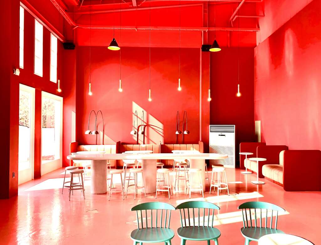
Best Used: Dining rooms, home gyms, social lounges
Avoid in: Bedrooms, meditation areas
Blue: The Tranquilliser
Blue is often considered the world’s favourite colour, and it’s not surprising why. It inspires trust, calmness, and clarity. Studies indicate that blue surroundings can lower blood pressure and slow down heart rates, which is why they’re best used in rooms meant for relaxation or concentration.
But excessive use of blue or the use of cold, bluish tints can create a cold or aloof atmosphere. The key is balance—use blue alongside warm lighting or natural materials such as wood or linen.
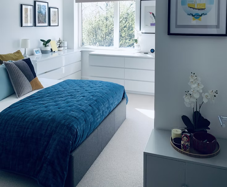
Best Used: Bedrooms, home office spaces, bathrooms
Avoid in: Kitchen, rooms with restricted natural light
Yellow: The Mood Booster
Yellow is linked with optimism, energy, and creativity. It’s a vibrant colour that can enhance joy and illuminate spaces—literally and figuratively. Research has found that rooms painted yellow can increase concentration and memory recall, so it’s a highly sought-after colour for home offices or classrooms.
But yellow has a double edge. In high concentrations, particularly in its most saturated hues, it induces eye irritation and irritability. Babies cry more in yellow rooms, and grown-ups feel more nervous in too much of it.
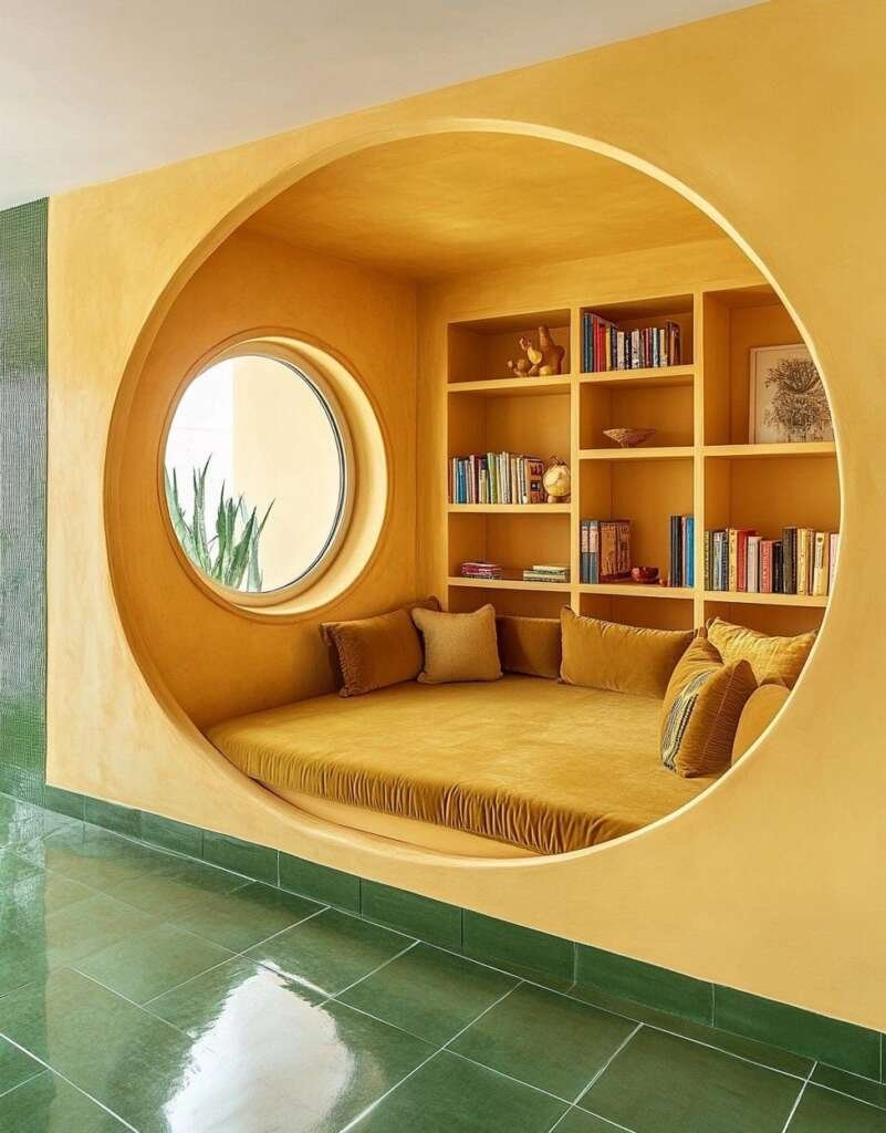
Best Used: Kitchens, creative studios, breakfast nooks
Avoid in: Nurseries, bedrooms
Green: Nature’s Neutral
Green, the colour of renewal and equilibrium, is grounding. It rests in the middle of the colour wheel, and that is perhaps why it’s so reassuring visually. Green minimises eye strain, represents growth, and grounds us in nature.
Biophilic design—it’s an architectural strategy that brings nature indoors—frequently uses green to build peaceful, restorative spaces. Using paint, plants, or fabric, green’s adaptability makes it a designer’s darling in residential and commercial work.
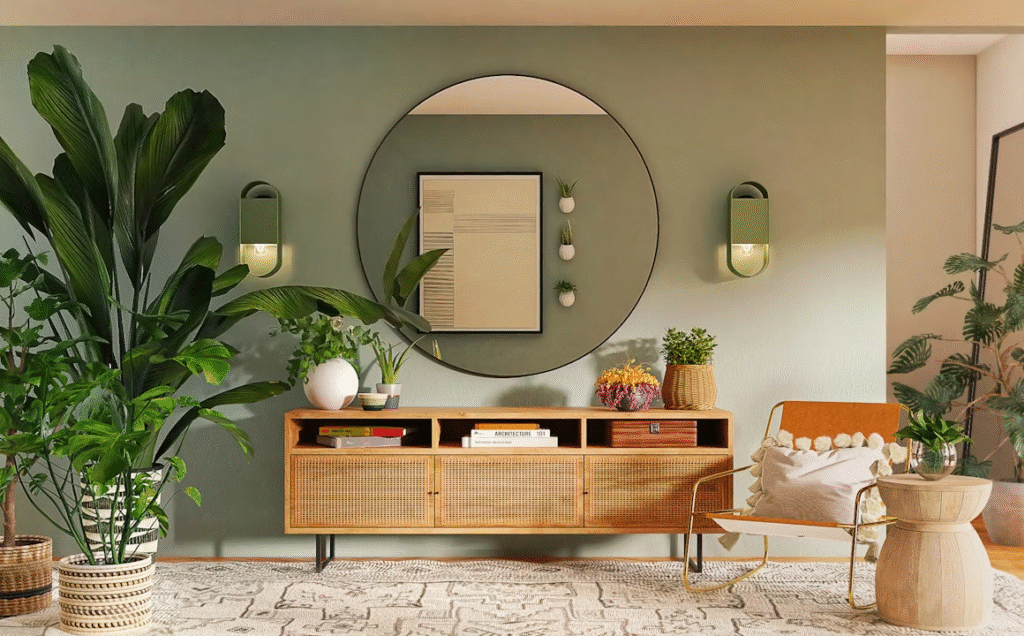
Best Used: Living rooms, home offices, healthcare facilities
Avoid in: Extremely dark rooms (can be stifling)
White: The Illusionist
White is commonly associated with purity, space, and cleanliness. In the right use, it can make a small room seem spacious and airy. It also creates an excellent background to highlight art, furniture, or natural light.
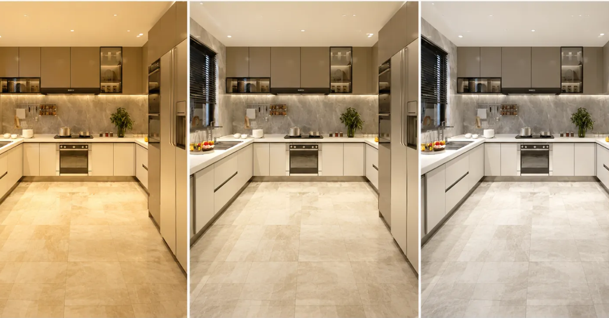
Not every white, though, is the same. There’s warm white (with yellow or pink undertones) and cool white (with blue or grey undertones). Selecting the wrong white can change the mood of a room from calming to sterile.
Interestingly, all-white spaces have been associated with greater cognitive exhaustion in certain research, particularly in workplaces. A little contrast or texture can counteract that.
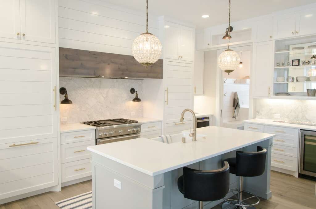
Best Used: Kitchens, galleries, and minimal spaces
Avoid in: Kids’ bedrooms, large cold-facing spaces
Black and Dark Shades: The Dramatic Anchors
As opposed to its image, black can be extremely refined when applied thoughtfully. It provides contrast, depth, and anchors a room. Dark colours can make a room appear cosier, not smaller.
Charcoal, navy, and forest green are also making a comeback, especially in modern and high-end interiors. When used with proper lighting and offset with lighter tones, they contribute richness and character.
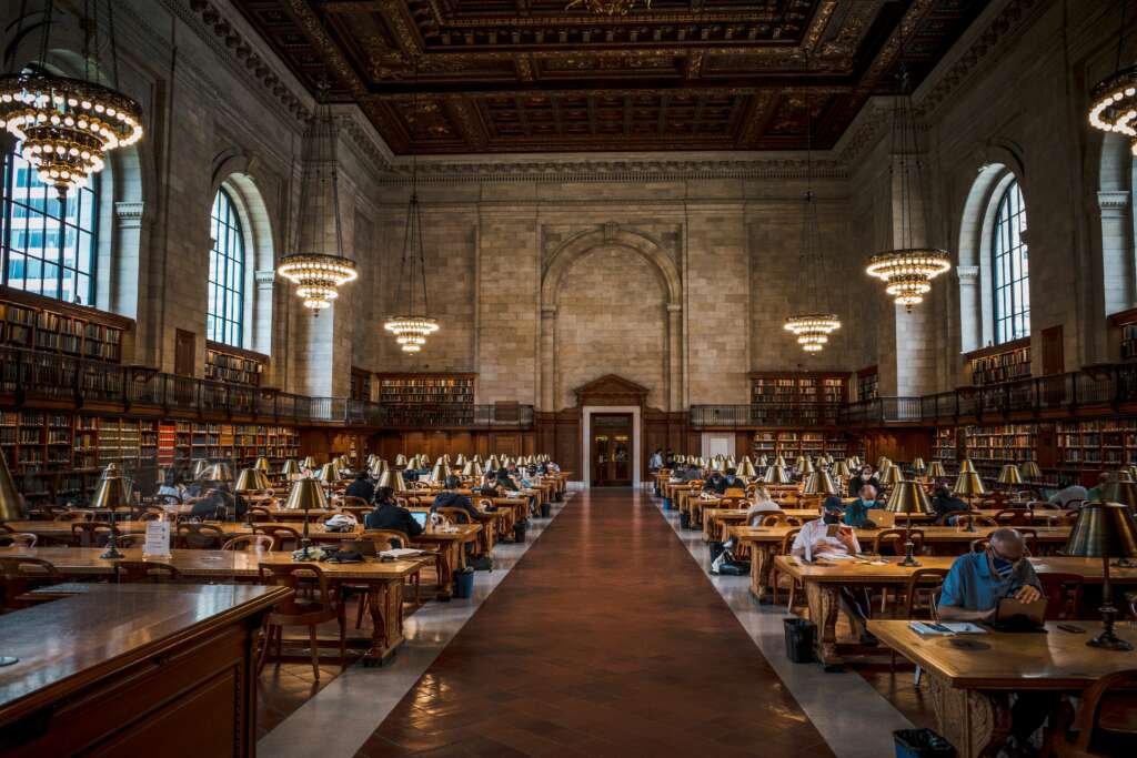
Best Used: Accent walls, powder rooms, libraries
Avoid in: Low-ceilinged or dimly lit areas
Colour Combinations Matter
A single colour is not often found on its own. How colours interact—through contrast, harmony, or saturation—elicits emotional reactions richer than any one colour.
Consider the timeless duo of blue and white: nautical, fresh, and crisp. Or green and tan: grounding and earthy. Designers will sometimes employ the 60-30-10 rule—60% primary colour, 30% secondary colour, 10% accent—to create visual balance while maintaining psychological effect.
Also Read – What Materials Will Dominate Architecture in 2025? Here Are 10
Beyond Paint: Using Colour Psychology in Design
Colour psychology isn’t exclusive to wall paint. It carries over into:
- Furniture and upholstery
- Lighting (in both colour temperature and hue)
- Flooring and tiling
- Decor accessories
- Window treatments
Even natural elements like wood, stone, and metal influence how colours behave in a space. Matte vs glossy finishes, natural vs artificial light—all alter how a colour is perceived and felt.
Colour is not only a visual aid—it’s a language of emotion. As architects, designers, or homeowners, we use this language with every brushstroke, swatch of fabric, and piece of furniture. Knowing the science of colour psychology enables us to not only create beautiful interiors, but spaces that heal, energise, and inspire.
The next time you step into a room and feel instantly calm or inexplicably unsettled, take a look around. Chances are, the colours are speaking louder than the furniture.

Join the discussion