

Share This Article
Lighting can completely change the way a room feels, even when absolutely nothing else in the space changes. The same wall colour, furniture and flooring can appear warm and inviting under one light but flat, clinical or unusually yellow under another.
One of the biggest reasons for this difference is Colour Temperature. Yet it is also one of the most misunderstood parts of home lighting. Walk into a lighting store and you are suddenly choosing between 2700K, 3000K and 4000K without always knowing what those numbers actually mean.
Understanding Colour Temperature can help you create bedrooms that feel relaxing, kitchens that feel fresh, living rooms that feel welcoming and bathrooms where colours look clean and clear. So, between 2700K vs 3000K vs 4000K, which one should you actually choose?
The answer depends on the room, its materials, how you use it and the atmosphere you want to create.
What Is Colour Temperature?
Colour Temperature describes the appearance of white light and is measured in Kelvin, written as K. Despite the word “temperature”, it does not tell you how physically hot a bulb becomes. Instead, it describes whether the light appears visually warm, neutral or cool.
A lower Colour Temperature produces warmer-looking light with more yellow or amber tones. As the Kelvin value increases, the light gradually becomes whiter and then cooler in appearance.
This means 2700K has a noticeably warm quality, 3000K is still warm but cleaner, and 4000K gives a more neutral-to-cool white appearance.
The difference may sound small on paper, but inside an interior it can be dramatic. Colour Temperature influences how finishes appear, how comfortable a room feels and even whether a beautifully designed interior looks sophisticated or slightly “off”.
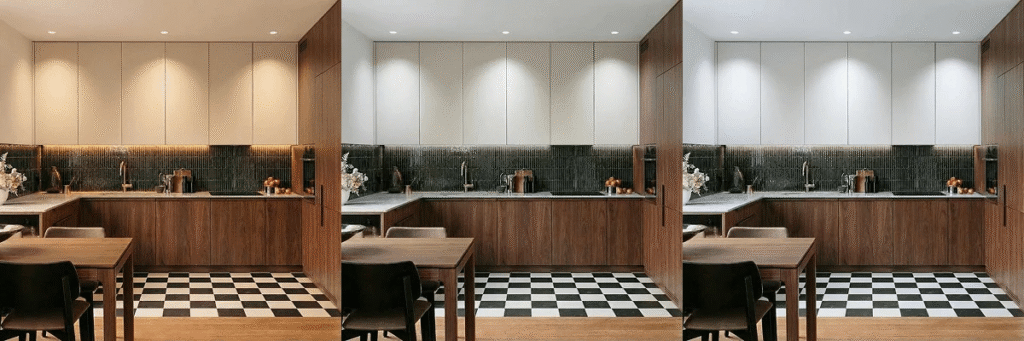
2700K vs 3000K vs 4000K: The Difference in Simple Terms
Think of 2700K as cosy, 3000K as balanced and 4000K as crisp.
At 2700K, the light has a distinctly warm character similar to the familiar appearance associated with traditional incandescent lighting. It works beautifully when the aim is relaxation, warmth and intimacy.
At 3000K, the Colour Temperature becomes slightly whiter while retaining warmth. It is one of the easiest options to work with in contemporary homes because it can complement both warm materials and modern finishes.
At 4000K, the light feels noticeably cleaner and more neutral. This Colour Temperature can be useful in task-oriented areas where visibility and a fresh atmosphere matter more than creating a cosy glow.
There is no single “best” Colour Temperature for an entire home. In fact, forcing one Kelvin value into every room is often where home lighting begins to feel monotonous.
Also read – Stunning Lighting Design Ideas That Transform Ordinary Interiors Into Luxury Spaces
2700K: When You Want the Room to Feel Warm and Relaxed
Among the three options, 2700K delivers the warmest appearance. It brings a soft yellowish quality to the light and can make an interior feel immediately more relaxed.
This Colour Temperature pairs especially well with wood, beige, cream, terracotta, warm stone, brass and earthy fabrics. It can also make traditional and classic interiors feel richer because it reinforces naturally warm materials.
However, 2700K is not automatically right for every space. In a highly minimal interior dominated by cool grey, bright white or blue-toned finishes, the warmer Colour Temperature may sometimes make surfaces appear more yellow than intended.
That is why choosing lighting only by looking at the bulb is rarely enough. You need to think about what that Colour Temperature will illuminate.
3000K: The Flexible Middle Ground
If 2700K feels slightly too warm but 4000K feels too clinical, 3000K often becomes the sweet spot.
A 3000K Colour Temperature still feels comfortable and residential, but it delivers a cleaner white than 2700K. This makes it particularly effective in contemporary homes, where interiors often mix warm natural materials with cleaner architectural finishes.
Think of a living room with timber furniture, white walls, marble surfaces and black metal detailing. A 2700K light might emphasise the timber beautifully but warm up the white surfaces considerably. A 4000K light could make the whites look sharper but reduce some of the room’s softness.
At 3000K, the Colour Temperature can often bridge both worlds.
This versatility explains why 3000K frequently works across living spaces, dining rooms, passageways and even kitchens where homeowners want clarity without making the interior feel commercial.
4000K: Clean, Crisp and More Task-Focused
A 4000K Colour Temperature produces a noticeably whiter appearance. Compared with 2700K and 3000K, it tends to feel fresher, brighter and more task-oriented.
This can make 4000K useful in kitchens, utility areas, wardrobes, study zones and certain bathrooms. Spaces where you need to see details clearly can benefit from a more neutral white light.
But more Kelvin does not necessarily mean better lighting.
Using 4000K everywhere can make a home feel visually harder, particularly during the evening. A living room designed around warm timber, soft furnishings and textured fabrics may lose some of its intimacy under a cooler Colour Temperature.
The purpose of lighting should guide the choice, not simply the belief that whiter light equals brighter light.
What Colour Temperature Is Best for the Living Room?
For most living rooms, 2700K to 3000K is the most comfortable range.
A living room is typically where people unwind, talk, watch television, entertain guests and spend slower parts of the day. Because of this, the Colour Temperature should support comfort rather than make the room feel overly functional.
Choose 2700K if the room has warmer colours, traditional furniture, rich wood or a particularly intimate atmosphere. It creates a softer glow that works beautifully with table lamps, floor lamps and decorative lighting.
For a modern living room with white walls, stone, contemporary furniture and cleaner detailing, 3000K may be more suitable. The slightly more neutral Colour Temperature keeps the space fresh without sacrificing warmth.
4000K can work for specific task lights within a living room, but using it as the dominant Colour Temperature may feel unnecessarily stark in many homes.

What Colour Temperature Should a Bedroom Use?
Bedrooms usually benefit most from 2700K.
Your bedroom is not an office, showroom or workspace. It is a place designed primarily for rest, and the lighting should visually reinforce that purpose.
A 2700K Colour Temperature creates a softer and more intimate atmosphere around beds, curtains, upholstery and timber finishes. Bedside lamps, cove lighting and decorative pendants can all feel particularly inviting at this level.
A 3000K Colour Temperature can also work well in contemporary bedrooms, particularly when the design contains cleaner whites, light oak or minimal finishes.
Instead of filling the bedroom with 4000K downlights, consider using warmer general lighting while providing stronger task lighting only where it is actually needed, such as around wardrobes or dressing areas.
The Kitchen Needs More Than One Answer
The kitchen is where Colour Temperature becomes more interesting because the room has two personalities.
It is both a functional workspace and, increasingly, a social space.
For work surfaces, food preparation areas and counters, a Colour Temperature around 3000K to 4000K can create better visual clarity. Philips Hue, for example, notes that cooler white light around 4000K can support food-preparation areas, while 2700K–3000K can create a more relaxed dining atmosphere.
This is why layered lighting works so well in kitchens.
A contemporary kitchen might use 3000K general ceiling lighting, 3500K or 4000K around specific work areas and warmer decorative pendants above the dining counter.
The important thing is to prevent the Colour Temperature changes from feeling accidental. Lighting should transition logically rather than creating obvious patches of yellow and white throughout the room.
What Colour Temperature Works Best for a Dining Room?
Dining rooms should generally lean warmer.
A Colour Temperature of 2700K can make meals, timber furniture and decorative finishes feel richer and more inviting. It also creates a more intimate atmosphere for evening dining.
For contemporary dining spaces integrated with the living room or kitchen, 3000K is an excellent alternative. It offers enough warmth for hospitality while transitioning more naturally into adjacent spaces that may need slightly stronger illumination.
4000K is rarely the first choice for decorative dining lighting because it can make the setting feel more functional than atmospheric.
This is one room where mood deserves priority.
What Colour Temperature Should You Choose for the Bathroom?
Bathrooms are slightly more complicated because they require both atmosphere and accuracy.
A warm 2700K bathroom may feel luxurious around a bathtub or ambient lighting feature, but it may not provide the visual neutrality you want around a mirror.
For general bathroom lighting, 3000K is often an effective compromise. This Colour Temperature feels comfortable while remaining clear enough for everyday routines.
Around mirrors or vanity areas, some homeowners prefer 3500K to 4000K for a cleaner appearance. However, Colour Temperature alone does not determine how naturally skin tones and colours appear. The colour-rendering quality of the light source matters as well.
ENERGY STAR distinguishes Colour Temperature from Colour Rendering Index, or CRI. CCT describes whether the light appears warmer or cooler, while CRI relates to how colours appear under that light.
So, do not buy a bathroom light simply because the Kelvin number sounds right. Look at both Colour Temperature and colour rendering.
What Colour Temperature Is Best for a Home Office?
A home office generally needs to feel more alert and focused than a bedroom or living room.
For that reason, 3000K to 4000K can work well depending on the atmosphere you prefer. A 3000K Colour Temperature offers a softer residential quality, while 4000K creates a cleaner, more task-oriented environment.
If your home office doubles as a study, studio or detailed workspace, 4000K may be particularly useful around the desk.
However, avoid assuming that changing Colour Temperature alone will fix poor workspace lighting. Glare, fixture positioning, natural daylight, brightness and contrast can be just as important.
A beautifully chosen Colour Temperature cannot compensate for a light shining directly into your eyes.
Wardrobes and Dressing Areas Need Clearer Light
Opening a wardrobe under dim, overly warm lighting can make dark blue look black and certain neutral colours difficult to distinguish.
A Colour Temperature around 3000K to 4000K generally gives wardrobes a cleaner appearance. For dressing spaces, the quality of colour rendering becomes especially important because fabrics, makeup and skin tones should appear natural.
If the dressing zone is connected directly to a bedroom, 3000K can create a smoother transition. It is noticeably clearer than 2700K without introducing the stronger contrast that a 4000K source may create beside very warm bedroom lighting.
Consistency matters almost as much as the actual Kelvin value.
What About Corridors, Foyers and Entrance Areas?
Entrance areas create the first impression of a home, which is why excessively harsh lighting can work against even a beautifully designed interior.
A Colour Temperature of 2700K to 3000K generally creates a welcoming atmosphere in foyers and corridors.
For homes with warm materials, art and textured finishes, 2700K can add depth. In modern apartments with pale stone, whites and minimal detailing, 3000K can maintain warmth while making the architecture appear slightly cleaner.
Rather than turning passages into brightly illuminated tunnels, use Colour Temperature together with layered wall lights, concealed lighting or focused accent lighting to create depth.
Why Your Wall Colours Look Different Under Different Lights
One of the most overlooked effects of Colour Temperature is what it does to paint.
A warm white wall under 2700K may look creamy or slightly beige. Move the same wall under 4000K and it can suddenly appear much more neutral.
The effect becomes even stronger with subtle colours such as greige, sage, taupe, dusty pink or warm grey. These shades contain undertones that different lighting conditions can exaggerate.
This is why interior designers often examine material samples under the lighting that will actually be installed.
Never finalise an important paint or finish solely under showroom lighting. The Colour Temperature inside your home could make it look significantly different.
Colour Temperature Is Not the Same as Brightness
This is perhaps the most common lighting mistake.
A 4000K lamp may appear visually crisper than a 2700K lamp, but that does not automatically mean it produces more light. Brightness is typically discussed in lumens, while Colour Temperature tells you about the visual appearance of the white light.
So, if a room feels too dark, moving from 2700K to 4000K is not necessarily the correct solution.
You may instead need higher lumen output, more fixtures, better placement or a different lighting layer.
Understanding the difference between brightness and Colour Temperature prevents you from accidentally turning a cosy room into a cold-looking room while trying to make it brighter.
Should the Entire Home Have the Same Colour Temperature?
Not necessarily, but your lighting should still feel connected.
Using 2700K in a bedroom and 4000K in a kitchen can make complete sense because the rooms perform very different functions. Problems appear when several dramatically different Colour Temperature values are visible at the same time without intention.
Imagine looking from a 2700K living room directly into a 4000K open kitchen. The contrast may be much more obvious than expected.
In open-plan spaces, maintaining a relatively consistent Colour Temperature for the main architectural lighting often creates a calmer result. You can then introduce warmer or cooler light through secondary layers where required.
For many contemporary open-plan homes, 3000K can work well as that visual bridge.
Do Materials Influence the Right Colour Temperature?
Absolutely.
Colour Temperature should never be selected independently from the interior palette.
Warm timber, brass, terracotta, beige stone and earthy textiles tend to respond beautifully to warmer lighting. Cooler stone, crisp whites, polished surfaces and highly minimal interiors may tolerate or benefit from a more neutral Colour Temperature.
That does not mean every marble kitchen automatically needs 4000K or every wooden bedroom requires 2700K. It simply means the materials should be viewed under the proposed lighting before the final decision is made.
The best Colour Temperature is the one that supports the design rather than fighting against it.
2700K vs 3000K vs 4000K for Indian Homes
Indian homes often combine multiple activities within the same room. A dining table might double as a work desk. A living room may be used for entertaining guests, television, reading and family gatherings.
That makes flexible lighting especially valuable.
Instead of choosing one harsh general light for everything, consider building layers. A 3000K general Colour Temperature can work across many contemporary interiors, while warmer decorative lighting can create atmosphere in the evening and more task-focused lighting can support kitchens, wardrobes or study areas.
Homes with warmer traditional materials may lean more heavily towards 2700K, while highly contemporary interiors may prefer 3000K as the dominant Colour Temperature.
4000K is often better treated strategically rather than automatically installing it throughout every room.
Can You Mix 2700K, 3000K and 4000K in One Home?
Yes, and when done carefully, mixing Colour Temperature can actually improve the lighting design.
The key is hierarchy.
Rooms designed for relaxation can sit at the warmer end of the spectrum. Functional spaces can become slightly cooler. Transitional spaces can sit somewhere between them.
What you want to avoid is random mixing within the same visual field.
A ceiling with some downlights at 2700K and others at 4000K will usually look inconsistent unless the contrast is part of an intentional lighting concept.
If you are uncertain, choose one main Colour Temperature for each zone and use additional temperatures only where there is a clear purpose.
Dimmable and Tunable Lighting Can Solve the Debate
Modern lighting increasingly allows homeowners to change Colour Temperature instead of committing permanently to one number.
Tunable-white systems can shift from warmer to cooler light depending on the activity or time of day. This means a kitchen could use cooler task lighting while cooking and transition towards warmer lighting during dinner.
Some dim-to-warm LED products go a step further by becoming warmer as they are dimmed, mimicking the behaviour associated with traditional incandescent or halogen lighting. The U.S. Department of Energy notes that these products may operate around 2700K–3000K at full output and become warmer when dimmed.
For multifunctional homes, this flexibility can make Colour Temperature far easier to manage.
The Most Common Colour Temperature Mistake
The biggest mistake is choosing light purely from a catalogue or packaging label.
Two interiors using the same Colour Temperature can feel completely different depending on wall colours, daylight, ceiling height, finishes, fixture type and brightness.
Before ordering dozens of fixtures, test a sample inside the actual space whenever possible.
Turn it on during the day. Look again after sunset. Check how your flooring, walls, furniture and skin tones appear.
The few minutes spent testing Colour Temperature can prevent an expensive lighting decision from affecting every room in the house.
So, Should You Choose 2700K, 3000K or 4000K?
There is no universal winner in the 2700K vs 3000K vs 4000K debate.
Choose 2700K when comfort, intimacy and warmth matter most. Bedrooms, relaxed living rooms and decorative dining spaces often benefit from this softer Colour Temperature.
Choose 3000K when you want warmth with a cleaner contemporary appearance. It is one of the most versatile Colour Temperature options for modern homes and can transition comfortably between living areas, kitchens, corridors and bathrooms.
Choose 4000K when visual clarity and task performance are priorities. Kitchens, home offices, utility zones, wardrobes and specific bathroom applications may benefit from its cleaner appearance.
The smartest homes rarely treat Colour Temperature as a one-number decision.
Good Lighting Is About How the Room Should Feel
The difference between an average interior and a beautifully resolved one is often not another expensive material or decorative object. Sometimes, it is simply the light falling on everything that is already there.
Colour Temperature influences whether timber looks rich, whether white walls feel warm or crisp, whether bedrooms invite you to unwind and whether kitchens feel comfortable to work in.
Instead of asking whether 2700K, 3000K or 4000K is universally best, ask a better question: what should this particular room feel like and what needs to happen here?
Once you answer that, choosing the right Colour Temperature becomes much easier.
For most homes, 2700K works beautifully for relaxation, 3000K offers an adaptable balance and 4000K performs well where cleaner, task-focused light is needed.
The right Colour Temperature does not call attention to itself. It simply makes the entire room look and feel the way it was meant to.