

Share This Article
Choosing colours for a home often sounds simple until you actually have to do it. A wall colour looks perfect on a sample card, a sofa feels right in the showroom, and a striking rug seems impossible to resist. But once everything comes together in the same room, the result can sometimes feel disconnected, visually heavy or simply unfinished. This is exactly where the 60-30-10 Rule in Interior Design becomes useful.
The 60-30-10 Rule in Interior Design is a simple colour-distribution principle that helps create visual balance within a room. Instead of choosing colours independently, the rule suggests dividing the overall palette into three proportions: roughly 60% dominant colour, 30% secondary colour and 10% accent colour.
What makes the 60-30-10 Rule in Interior Design especially practical is that it works across different interior styles, room sizes and colour palettes. Whether you are designing a minimalist apartment, a warm contemporary home, a colourful living room or a quiet bedroom, the principle gives you a framework without making the space feel formulaic.
What Is the 60-30-10 Rule in Interior Design?
The 60-30-10 Rule in Interior Design is essentially a guideline for distributing colours across a room. The largest proportion, 60%, establishes the dominant visual identity. Another 30% introduces a supporting colour, while the final 10% adds contrast, personality and visual interest.
Think of the 60% as the background of the room, the 30% as the supporting layer and the 10% as the punctuation mark. Used thoughtfully, the 60-30-10 Rule in Interior Design prevents too many colours from competing for attention while also stopping a room from becoming excessively uniform.
Importantly, these percentages are not mathematical requirements. Nobody needs to measure the exact surface area of a sofa or calculate the percentage occupied by curtains. The 60-30-10 Rule in Interior Design works best as a visual guide rather than a rigid equation.
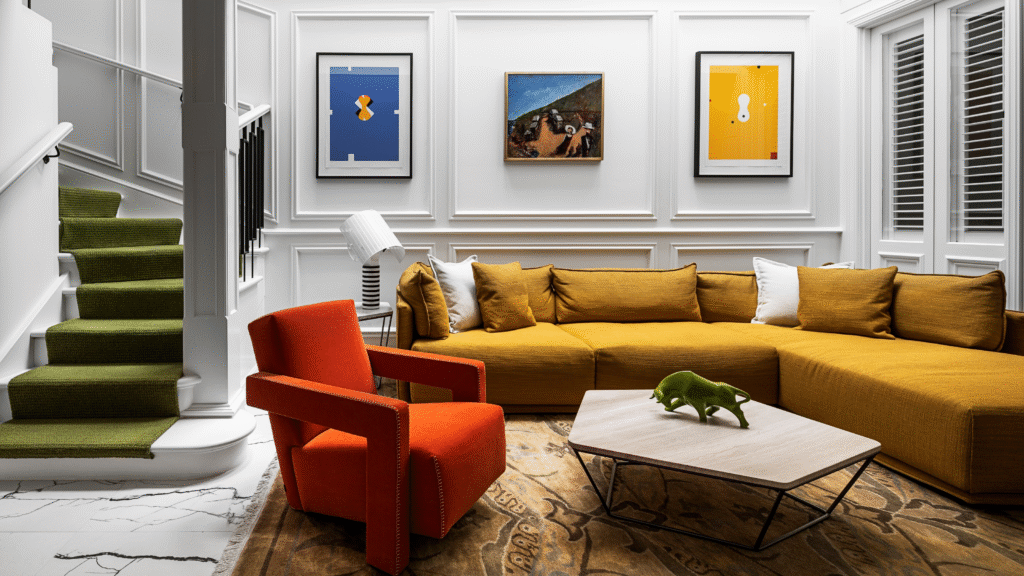
Why the 60-30-10 Rule in Interior Design Works So Well
One reason the 60-30-10 Rule in Interior Design continues to remain popular is that it creates hierarchy. When every colour appears with equal strength, the eye does not know where to focus. A room may contain beautiful individual pieces but still feel visually chaotic.
With the 60-30-10 Rule in Interior Design, one colour clearly dominates, another supports it and a third provides emphasis. This creates rhythm and makes the overall composition easier to understand visually.
The rule is also useful because people rarely experience interiors as isolated objects. We perceive walls, ceilings, furniture, fabrics, flooring and decorative elements together. The 60-30-10 Rule in Interior Design helps connect these elements into one coordinated palette rather than allowing each item to compete independently.
Also read – 7 Powerful Lessons from Seoul’s Compact City Architecture for Indian Metros
Understanding the 60% Dominant Colour
The dominant colour forms the foundation of the 60-30-10 Rule in Interior Design. It normally occupies the largest visual surfaces in a room and establishes the overall mood.
Walls are often part of the 60% because of their scale, but they do not always have to carry the dominant colour alone. Flooring, large rugs, kitchen cabinetry or major furniture pieces can also contribute to this percentage.
For example, in a warm neutral living room, beige walls, cream flooring and a large ivory rug could collectively form the 60% base. In this case, the 60-30-10 Rule in Interior Design does not mean one exact shade must cover most of the room. Closely related tones can work together as the dominant colour family.
The key is visual consistency. When someone enters the room, one overall colour impression should clearly feel stronger than everything else.
What the 30% Secondary Colour Should Do
The secondary colour is where the 60-30-10 Rule in Interior Design begins to develop depth. This colour should be noticeable enough to distinguish itself from the dominant palette but not so strong that it takes over the space.
Furniture upholstery, curtains, accent walls, bed linen, wardrobes and larger decorative objects often work well within the 30% layer.
Imagine a bedroom where warm white forms the main 60% palette. A muted sage green used across the upholstered headboard, curtains and bedding could form the 30% secondary layer. The 60-30-10 Rule in Interior Design creates enough repetition for the green to feel intentional without overwhelming the room.
The relationship between the dominant and secondary colours is important. They may be complementary, tonal, analogous or deliberately contrasting depending on the character you want the room to have.
The 10% Accent Colour Is Where Personality Appears
The smallest part of the 60-30-10 Rule in Interior Design often has the greatest visual impact. The 10% accent colour is usually where designers introduce energy, contrast or surprise.
Cushions, artwork, lamps, decorative ceramics, side tables, flowers, throws and accessories can all contribute to this layer. Because the accent colour appears in smaller quantities, it can often be bolder than the rest of the palette.
A room dominated by soft beige and walnut, for example, could use deep rust as its accent. A blue-and-white room could introduce mustard yellow. The 60-30-10 Rule in Interior Design gives stronger colours room to make an impression without allowing them to dominate the entire interior.
This is also the easiest part of the palette to change. Replacing a few cushions, accessories or artworks can alter the mood of the room without requiring a major redesign.

How to Use the 60-30-10 Rule in Interior Design in a Living Room
Living rooms are among the easiest spaces in which to understand the 60-30-10 Rule in Interior Design because they usually contain several layers of furniture, finishes and décor.
Suppose a living room has warm off-white walls and pale limestone flooring. Together, these elements could represent the 60% dominant palette. A large olive-green sofa, curtains and an occasional chair could establish the 30% secondary colour.
The remaining 10% could appear through brass lighting, burnt orange cushions and artwork containing similar warm tones. Here, the 60-30-10 Rule in Interior Design ensures that the room feels coordinated without requiring every element to match perfectly.
In a darker contemporary living room, the same formula could work very differently. Charcoal grey might dominate, natural oak could form the secondary layer and cobalt blue could become the accent. The principle remains the same even when the palette changes completely.
Using the 60-30-10 Rule in Interior Design in a Bedroom
Bedrooms usually benefit from calmer colour relationships, making the 60-30-10 Rule in Interior Design particularly useful when creating a restful atmosphere.
The dominant 60% could include soft grey walls, a pale ceiling and neutral flooring. The secondary 30% might appear through dusty blue bedding, curtains and an upholstered headboard. The final 10% could introduce burgundy or terracotta through cushions, bedside accessories and artwork.
Using the 60-30-10 Rule in Interior Design in bedrooms can also prevent the common mistake of making everything neutral. A completely beige room may feel calm, but without tonal variation or contrast, it can also feel visually flat.
The 30% and 10% layers introduce enough difference to make the bedroom feel considered rather than unfinished.
Making the Rule Work in Kitchens
Applying the 60-30-10 Rule in Interior Design to kitchens requires a slightly different approach because cabinetry, countertops, flooring and appliances occupy significant visual space.
In a modern kitchen, white cabinetry and walls could make up the dominant 60%. Natural wood finishes on an island, shelving or lower cabinetry could account for around 30%, while black fixtures, pendant lights and hardware could form the final 10%.
Alternatively, the 60-30-10 Rule in Interior Design can be reversed visually in bolder kitchens. Deep blue cabinetry might dominate, a pale stone countertop could create the secondary layer and brushed brass hardware could provide the accent.
The important point is not achieving exact percentages. Instead, the room should have a clear visual hierarchy where one colour leads, another supports and a smaller detail provides emphasis.
Can the 60-30-10 Rule in Interior Design Work in Small Homes?
The 60-30-10 Rule in Interior Design can be especially valuable in smaller apartments because too many competing colours can make compact interiors feel visually crowded.
Using one dominant colour across walls and major surfaces can create continuity. A secondary colour can then introduce definition through furniture, while smaller accent elements keep the home from appearing monotonous.
For instance, a compact apartment could use warm white as its dominant colour, light oak as the secondary colour and forest green as an accent. Because the 60-30-10 Rule in Interior Design limits the number of strong visual elements, the home can feel cohesive without becoming plain.
Smaller rooms do not necessarily require only pale colours either. The rule can work with dramatic shades as long as the relationship between dominant, secondary and accent tones remains clear.
The 60-30-10 Rule in Interior Design Is Not Only About Paint
One of the biggest misunderstandings about the 60-30-10 Rule in Interior Design is that it applies only to wall colours. In reality, interior colour comes from almost everything within a space.
Timber has colour. Stone has colour. Upholstery, metal, glass, flooring and lighting all influence how a palette is perceived. Even natural materials such as rattan, marble or concrete contribute to the overall colour composition.
A living room with white walls might still have warm brown as its dominant visual tone if timber floors, wooden cabinetry and large furniture occupy much of the space. Applying the 60-30-10 Rule in Interior Design requires looking at the room as a complete composition rather than focusing only on painted surfaces.
How Materials Can Become Part of the 60-30-10 Palette
Using materials instead of flat colours can make the 60-30-10 Rule in Interior Design feel considerably more sophisticated.
Imagine a room where creamy lime-plastered walls form the dominant 60%, dark walnut furniture establishes the 30% and aged brass provides the 10%. Technically, the colour palette is simple, but differences in texture and reflectivity make the interior feel layered.
Similarly, exposed concrete could become the dominant grey, timber could provide the secondary warmth and blackened steel could form the accent. The 60-30-10 Rule in Interior Design therefore works just as effectively with material palettes as it does with conventional colour palettes.
This approach is especially relevant in contemporary interiors where texture often plays an equally important role as colour.
Do You Need Three Completely Different Colours?
No. The 60-30-10 Rule in Interior Design does not require three dramatically different colours.
A monochromatic interior can use three variations of the same colour family. For example, pale beige could form 60%, caramel could provide 30% and dark chocolate brown could create the final 10%.
The 60-30-10 Rule in Interior Design is about visual hierarchy rather than simply counting colours. Contrast can come from tone, saturation, texture or material rather than hue alone.
This is particularly useful for homeowners who prefer quiet interiors but still want enough variation to prevent the space from looking one-dimensional.
How Lighting Changes the 60-30-10 Rule in Interior Design
Colour should never be selected without considering light. The same 60-30-10 Rule in Interior Design palette can look dramatically different depending on natural daylight, artificial lighting and the orientation of the room.
Warm artificial lighting can make beige, terracotta, timber and yellow tones appear richer, while cooler lighting may make grey and blue tones appear sharper. Natural sunlight can also change throughout the day, altering how dominant and secondary colours are perceived.
Before finalising the 60-30-10 Rule in Interior Design, it is useful to test paint, upholstery and material samples inside the actual room. A colour viewed under showroom lighting may not behave the same way at home.
The percentages may remain identical, but the visual effect can change considerably depending on light.
Using Neutrals Without Making the Room Boring
Neutral interiors are one of the most common applications of the 60-30-10 Rule in Interior Design, but they also reveal why subtle contrast matters.
A white, beige and cream room can quickly become visually flat if every finish has the same tone and texture. Instead, the dominant 60% could use warm white, the secondary 30% could introduce textured tan or natural timber, and the final 10% could bring in black or deep brown.
This version of the 60-30-10 Rule in Interior Design creates contrast without requiring bright colour. Texture can also contribute enormously. Bouclé, linen, stone, timber grain and brushed metal can make similar colours feel distinctly different.
A neutral home therefore does not need more colours. It usually needs better layering.
How to Use Bold Colours Without Overwhelming the Space
People often assume bold interiors require abandoning rules, but the 60-30-10 Rule in Interior Design can actually make saturated colour easier to control.
Consider a room where deep green forms the dominant palette, warm oak provides the secondary layer and burnt orange appears as the accent. Even though all three colours are noticeable, their hierarchy prevents the room from becoming chaotic.
Another approach is to keep the 60% relatively quiet and reserve intense colour for the remaining proportions. Soft grey walls could dominate, cobalt blue furniture could form the 30%, and bright red decorative elements could occupy the final 10%.
The 60-30-10 Rule in Interior Design allows homeowners to experiment with bold colours while maintaining enough structure for the room to feel deliberate.
Can You Break the 60-30-10 Rule in Interior Design?
Absolutely. The 60-30-10 Rule in Interior Design is a guideline, not an interior design law.
Some spaces may work better with a 70-20-10 palette, while others might feel more energetic using several accent colours. Designers may deliberately distribute colours unevenly to create drama, contrast or a particular spatial experience.
However, understanding the 60-30-10 Rule in Interior Design before breaking it can be valuable. The principle teaches you how visual hierarchy works, making it easier to recognise why a certain combination feels balanced or unbalanced.
In other words, the rule is most useful as a starting framework. Once the room feels cohesive, the percentages can evolve naturally.
Try the 60-30-10+10 Variation for More Colour
A popular variation of the 60-30-10 Rule in Interior Design introduces an additional accent. Instead of relying on a single 10% colour, you can add another smaller contrasting colour to create a more layered scheme.
For example, a room could use cream as the dominant colour, olive green as the secondary shade, terracotta as one accent and cobalt blue as a smaller additional highlight.
The idea is not to turn the 60-30-10 Rule in Interior Design into a complicated calculation. The dominant and supporting palette should still remain visually clear while smaller colours create personality.
This works particularly well in eclectic, maximalist or art-filled homes.
Using the 60-30-10 Rule Across an Entire Home
The 60-30-10 Rule in Interior Design does not have to stop at individual rooms. It can also help establish continuity across an entire apartment or house.
The dominant colour family could remain similar throughout the home, while secondary and accent colours change from room to room. For instance, warm white walls may connect the entire house, while bedrooms introduce blue, the living room features green and the dining area includes terracotta.
This creates visual continuity without making every room identical. The 60-30-10 Rule in Interior Design becomes a way of connecting spaces while still allowing each area to have its own character.
In open-plan homes, this approach becomes particularly valuable because several functional zones may be visible simultaneously.
Common Mistakes When Using the 60-30-10 Rule in Interior Design
One common mistake is treating the percentages too literally. The 60-30-10 Rule in Interior Design is intended to guide visual balance, not create anxiety about precise measurements. A room can still work perfectly if the actual distribution is closer to 55-35-10.
Another mistake is assuming that the accent colour must always be extremely bright. Black, dark timber, metallic finishes or even white can act as accents depending on the surrounding palette.
Homeowners also sometimes choose three attractive colours without considering whether they work together. The 60-30-10 Rule in Interior Design cannot rescue a palette where undertones clash badly. Warm whites, cool greys, red-based browns and yellow-based woods need to be evaluated together.
The relationship between colours remains just as important as their proportions.
Why Undertones Matter More Than Most People Realise
When applying the 60-30-10 Rule in Interior Design, understanding undertones can prevent costly mistakes.
Two beige colours may look similar individually but completely different beside one another. One might have pink undertones while another leans yellow. The same problem can occur with white, grey, blue and even timber finishes.
For a successful 60-30-10 Rule in Interior Design palette, place physical samples beside each other before committing. Look at them during morning light, afternoon light and artificial evening lighting.
A coordinated undertone can make even a simple palette feel refined, whereas clashing undertones can make expensive materials appear unexpectedly mismatched.
The Role of Texture in the 60-30-10 Rule in Interior Design
Colour balance becomes far more interesting when texture enters the picture. The 60-30-10 Rule in Interior Design does not require every appearance of the dominant colour to have the same finish.
A beige palette, for example, could combine matte plaster, linen curtains, woven rugs and textured upholstery. Even though these elements belong to the same colour family, their surfaces react differently to light.
The secondary 30% could appear through timber grain, while the accent 10% could introduce polished metal or glossy ceramics. This interpretation of the 60-30-10 Rule in Interior Design produces depth without adding excessive colour.
Texture is especially valuable in minimalist interiors where the palette is intentionally restrained.
Applying the Rule to Indian Homes
The 60-30-10 Rule in Interior Design adapts easily to Indian homes because it can accommodate both restrained contemporary interiors and richer palettes inspired by craft, art and local materials.
A modern Indian living room could use warm ivory as the dominant 60%, teak or walnut as the secondary 30% and deep vermilion as the final 10%. Another home might combine pale stone, sage green and antique brass.
The 60-30-10 Rule in Interior Design can also help balance patterned fabrics, colourful artworks, traditional rugs and handcrafted objects. Rather than removing visual richness, the rule gives those elements a clearer background against which they can stand out.
This makes the principle useful for homes that combine modern furniture with collected pieces, inherited objects or regional craft.
Does Every Room Need the Same 60-30-10 Combination?
No. One of the strengths of the 60-30-10 Rule in Interior Design is its flexibility.
A living room might feature cream, green and rust, while a bedroom uses cream, dusty blue and burgundy. Keeping one colour consistent can establish continuity, while changing the secondary and accent palettes gives each room its own identity.
You can also reverse colour roles between spaces. A shade used as the 10% accent in one room could become the 30% secondary colour in another. This is a subtle way of making the 60-30-10 Rule in Interior Design feel connected throughout the home.
The result is a house that feels coordinated without looking overly planned.
How to Choose Your Three Colours Before Decorating
Before applying the 60-30-10 Rule in Interior Design, begin with an element you genuinely want to keep. That could be a sofa, artwork, floor finish, rug, stone surface or existing piece of furniture.
Instead of choosing three colours randomly, build the palette around that anchor. If a rug contains beige, navy and rust, those colours could naturally become the dominant, secondary and accent layers.
The 60-30-10 Rule in Interior Design becomes far easier when the palette grows from something already present in the room.
This approach also reduces the possibility of creating a colour scheme that looks impressive on a digital mood board but does not relate to the actual materials in the home.
Why the 60-30-10 Rule in Interior Design Still Matters
Interior trends change constantly. Colour forecasts evolve, materials come in and out of fashion, and social media introduces new aesthetics almost every week. Yet the 60-30-10 Rule in Interior Design continues to remain useful because it is not tied to one particular style.
The rule is fundamentally about proportion and visual hierarchy. Whether the room is Scandinavian, maximalist, modern Indian, industrial, coastal, Japandi or contemporary, the underlying principle can still apply.
More importantly, the 60-30-10 Rule in Interior Design makes decorating easier for homeowners who may not have formal design training. Instead of wondering whether every individual object matches, you can evaluate whether it belongs to the dominant, supporting or accent layer.
That simple distinction can make dozens of decorating decisions feel much more manageable.
Use the Rule as a Guide, Not a Formula
The best interiors rarely look as though they were created by following an equation. They feel collected, balanced and natural. That is ultimately the purpose of the 60-30-10 Rule in Interior Design.
Use the 60% to establish the atmosphere of the room. Allow the 30% to introduce depth and contrast. Then use the final 10% to express personality through colour, art, objects, materials or unexpected details.
Once you understand the 60-30-10 Rule in Interior Design, you can follow it closely, reinterpret it or deliberately break it. What matters is maintaining enough hierarchy for the room to feel visually connected.
For real homes, the greatest advantage of the 60-30-10 Rule in Interior Design is not mathematical perfection. It is clear. It helps homeowners move beyond randomly matching colours and begin thinking about the room as one complete composition.
And when colour, material, texture and proportion begin working together, even a simple interior can feel considerably more intentional.