Share This Article
- The Tapestry Of Set Design
- Contrasting Environments
- Lighting and Color Palette
- Dynamic Spaces
- Spatial Design and Composition
- Critique and Analysis
Set design is an important element in cinema in influencing, visual storytelling and evoking emotions. The Oscar-winning film “Poor Things” is an excellent example, directed by a visionary filmmaker and brought to life by a team of talented designers. The film showcases the transformative power of design elements in creating rich, immersive worlds. As cinema evolves, set design becomes increasingly important, setting the tone and atmosphere of a film. This article delves into the intricate design and architectural elements in “Poor Things,” analyzing how they contribute to the film’s mood and narrative. From the very first frame, viewers fall into a world that feels familiar and surreal, due to the details in the set architecture. Set against the backdrop of late 19th-century Scotland, the film’s sets transport audiences to a bygone era, immersing them in the atmosphere of the period. In this blog, we will delve into the complex details and creative design choices that make the set architecture of “Poor Things” a true masterpiece of cinematic art.

The Tapestry Of Set Design
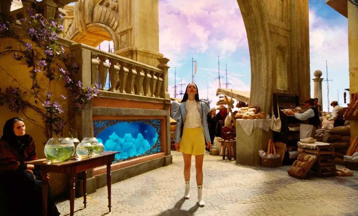
The movie “Poor Things” takes us to the streets of Victorian-era Glasgow, immersing us in a detailed and authentic world. Each set piece is crafted and directed with great care while giving attention to detail, from bustling cityscapes to serene countryside landscapes. Production designers limited no expense in the recreation of the Victorian era, with grand sets featuring complex architectural details and lavish furnishings. From towering spires of grand mansions to cobblestone streets lit by gas lamps, every set piece helps viewers to go back in time and immerse themselves in the world of the film.

Contrasting Environments
Contrasting settings in the movie contribute significantly to creating the mood and atmosphere. Each scene, from rich homes to rundown streets, is carefully designed to have a specific feeling. The remarkable difference between these settings tells the viewers about the societal inequalities of the Victorian period, but also highlights the main themes of class conflict and societal unfairness.
Lighting and Color Palette
The mood and ambience of “Poor Things” are further improved by the lighting and colour scheme used. A cosy and nostalgic ambience is typically achieved in intimate indoor settings by using soft, warm lighting. On the other hand, bright lighting is utilized to showcase the darker, more ominous parts of the story, heightening the feeling of suspense and stress. The choice of colours is just as crucial, with soft shades expressing sadness and control, while bright, vivid colours evoke strong feelings and intensity.
Dynamic Spaces
The set design in “Poor Things” is truly impressive. It can create fluid and dynamic spaces that change with the narrative. The sets seem to shift and change, just like the characters themselves. This blurs the line between reality and illusion by making the film even more fascinating. Viewers are invited to explore the many layers of meaning lying beneath the surface of each scene, which adds an extra layer of depth to the story.
Spatial Design and Composition
The arrangement and layout of the sets in “Poor Things” are carefully planned to elevate the visual narrative. Using framing and perspective adds depth and dimension, directing the audience’s gaze to important focal points in the frame. Skillful utilization of architectural components such as doorways, windows, and staircases helps direct the observer’s focus and strengthen the storyline. Also, the placement of items and furnishings in each scene is thoughtfully planned, mirroring the traits and goals of the individuals who are present in the environment.
Critique and Analysis
Although the set design of “Poor Things” is undoubtedly impressive, it still has some flaws. A critique is the sporadic use of stereotypical Victorian themes, leading to an exaggerated and melodramatic tone on occasion. Moreover, a few of the collections might not be genuine, containing elements that are out of place or inaccuracies in historical accuracy that diminish the overall experience. Even with these small flaws, the set design in “Poor Things” undeniably enhances the cinematic experience, effectively transporting viewers to a different era and location, thereby elevating the storytelling to new levels.
The influence of set design is highlighted in ‘Poor Things’, a visually captivating film that demonstrates the impact of set design. The narrative captivates and stimulates reflection with its meticulous attention to detail, innovative decisions, and smooth incorporation into the storyline. The variety of set designs, from elaborate Victorian houses to realistic urban settings, enhances the viewer’s knowledge, ensuring that it will be a celebrated cinematic achievement. The film’s architectural elements, including the Victorian mansion and urban landscapes, come together to form a visually stunning and captivating world.
Sources
- https://www.architecturaldigest.in/story/inside-the-surreal-world-of-emma-stones-poor-things-set-design-behind-the-scenes-yorgos-lanthimos/
- https://www.dezeen.com/2024/02/14/poor-things-set-design-shona-heath-james-price/
- https://www.housebeautiful.com/lifestyle/entertainment/a60128624/poor-things-should-win-oscar-best-production-design/
- https://www.indiewire.com/features/craft/poor-things-house-frankenstein-production-design-1234936529/
- https://www.fastcompany.com/90993919/the-movie-poor-things-features-the-years-most-imaginative-sets-heres-how-they-designed-them